
Visualizing NYC Department of Corrections Daily Inmate Records
In March of 2012, then Mayor of New York City Michael Bloomberg signed into law an amendment to city code mandating that all “public data” be made available on a single public portal: [NYC Open Data]https://opendata.cityofnewyork.us/). A neat summary of the history behind the law and legislation like it can be found in this 2017 article for govtech.com.
Since then, public data out of NYC has been used in a slew of neat projects. Similar portals exist for Chicago, Seattle, Washington DC, and many others.
I had never heard of the open city data movement until a coworker at CLNY mentioned work she was doing with NYC’s open data portal. I decided to give it a go myself!
The NYC Department of Corrections updates a database of basic information about their inmate population every day. To try out the NYC Open Data platform, I’m going to retrieve the updated data, generate some descriptive statistics, and create a few visualizations. The Vera Institute of Justice has a dashboard that does something similar here. I don’t expect to get the same quality of results in what is essentially a weekend project, but I might learn a thing or two along the way!
The goals of this project are to automatically retrieve data from NYC’s Open Data platform and generate visualizations representing the demographic makeup of inmates in detention. I am, for now, not focused on any predictive tasks or on statistical testing - I primarily want to familiarize myself enough with the Socrata platform to use it in future projects. For this writeup, I intend to outline both what I did and what is presented in the resulting visualizations.
All data for this project can be found on my github page.
Loading the data
Simply retrieving the data proved perhaps the most annoying part of the project. The NYC Open Data platform uses Socrata and with it, the OData protocol. This makes it easy to pull the data into Tableau or Excel, but the most common OData libraries in Python pyodata and python-odata both seemed to have trouble querying the service. Thankfully, someone built a wrapper for python’s requests library called sodapy that’s designed specifically for querying the Socrata Open Data API. This is what I ended up using to make my life easier - it can be installed via pip or conda if you want to check it out yourself.
The Daily Inmates records are updated every day. Unfortunately, it appears that no backlog of data for previous dates is made available via NYC Open Data. In addition to downloading the inmates file, I’ll also get the date of the file and update a running log of dates when the inmates file was downloaded. This will let me keep track of historical data as well as the current data.
From load_datasets.py
|
|
Socrata by default limits requests to a maximum of 1000 rows. It also throttles requests if you do not have an apptoken. The data_config that’s passed here contains the service URL, app token, username, and password (and is not in my repository - if you’re replicating the project, you’ll have to create your own .yml config file with these parameters).
Transforming the data
Most of the information we want to visualize is aggregate data. Generating this from the raw inmates dataframe repeatedly will be time consuming and inefficient at minimum. Instead, it’ll be easier to pre-emptively aggregate, then use further groupbys to get the information we need.
The groups that we care about for our visualizations are race, gender, custody level and gang affiliation. There are very few people classified with races of ‘I’ (Native American) or ‘U’ (Unknown), so I’ll collapse these into the ‘O’ (Other) category. In addition, I’ll want a “length_incarcerated” feature for visualizations later, so I generate that here.
From generate_features.py
|
|
Visualizations
Now the good stuff!
Note - we’re turning off the error bars in most of these charts because we’re representing the actual composition (on this date), not an estimate of averages.
The first, most obvious, thing to visualize is simply the demographic distribution of inmates. I did this in two ways: first, by inmate count, and second by sum of inmate hours incarcerated. I attempted to use Seaborn to create the stacked bar charts here, but Seaborn does not support stacking natively. Later I’ll resort to matplotlib for stacking with multiple categories.
|
|
And the resulting charts:
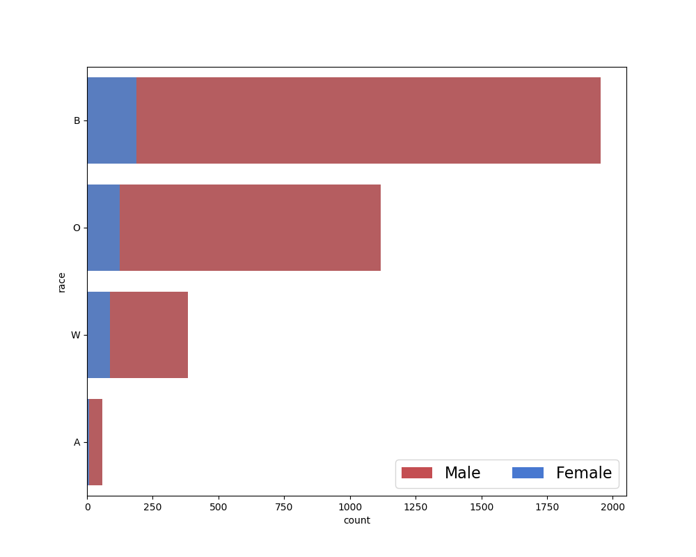
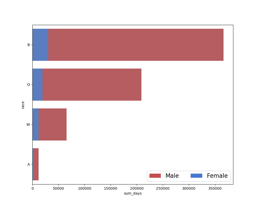
I felt that the second chart might add a little bit to the information from the first chart. By raw count, the prison demographics are predominantly non-white, and this is clear from the first chart. I was curious whether the discrepancy would grow further when taking length of time incarcerated into account. There didn’t appear to be much difference in this case, but I decided to examine the distribution of incarceration times anways:
|
|
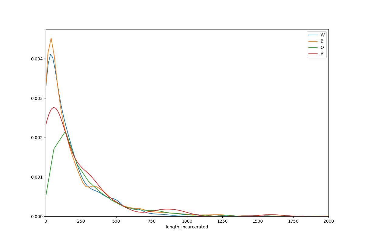
As might by expected, the distribution of incarceration lengths has a long right tail: there are relatively fewer people incarcerated for long periods of time. According to this report, the majority of inmates in NYC’s correctional system are unsentenced. Presumably, these inmates will exit incarceration relatively earlier than sentenced inmates. The dataset excludes sealed cases, and in NYC cases are sealed if the case results in a ‘favorable outcome’ for the defendant - but it’s unclear whether that means that the dataset excludes pretrial detainees. The chart cuts off here at 2000 days to make the data more clear, but there are inmates who have been imprisoned for longer, just very few.
While across all demographics it’s apparent that most inmates spend relatively little time incarcerated, there does appear to be some variation by demographics. Interestingly, both black and white inmates have a much greater proportion of their probability mass under 100 days than Asian American and “other” inmates.
I next wanted to visualize the distribution of custody levels in the population. The dataset classifies inmates into three custody levels: ‘MIN’, ‘MED’, and ‘MAX’. Unfortunately, NYC Open Data does not appear to provide any guide to what these custody levels mean. The NYC DOC operates 11 detention facilities (notably, the DOC also operates two hospital prison wards, and NYC is home to several detention facilities not run by the NYC DOC) which are classified as “minimum-security”, “medium-security”, and “maximum-security”. Presumably, custody level refers to the security level of the prison the inmate is housed in.
The Seaborn maintainers are not a big fan of stacked bar charts - but I am! So here I used pandas’ pivot feature and matplotlib’s ‘barh’ plot with a little bit of personalization:
|
|
I pivoted first by custody level, yielding the following chart:
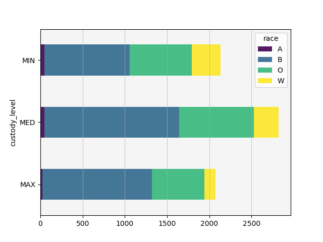
The first thing that stood out to me is that more prisoners are kept at ‘medium’ custody level than at ‘minimum’ or ‘maximum’ - and, in fact, minimum and maximum custody levels are relatively similar in count, albeit with different compositions. This is not what I expected - I’d be curious to see the distribution across security levels in different cities and states, but was unable to quickly find data for that.
Maximum security prisons house a much higher proportion of non-white inmates. In general, non-white inmates make up greater proportions at all security levels due to making up a relatively larger proportion of the whole population, but this is most apparent at the maximum security level, especially when we pivot by race.
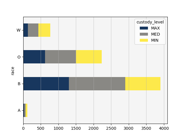
Almost half of white inmates, however, appear to be housed in minimum security detention centers. In fact, white inmates are the only inmates who are more likely to be in minimum security than in medium security, except possibly for Asian Americans. Black inmates appear almost equally likely to be in maximum or medium security, and least likely to be in minimum security prisons. Other inmates appear almost equally likely to be in minimum or maximum security, but more likely in general to be in medium security facilities.
With relatively few other variables available to me, I decided to examine if this discrepancy could at all be explained by looking at the gang affiliation flag. To that end, I created two additional pivot tables and stacked bar charts: one representing proportion of gang affiliation by race and one representing proportion of custody level by gang affiliation.
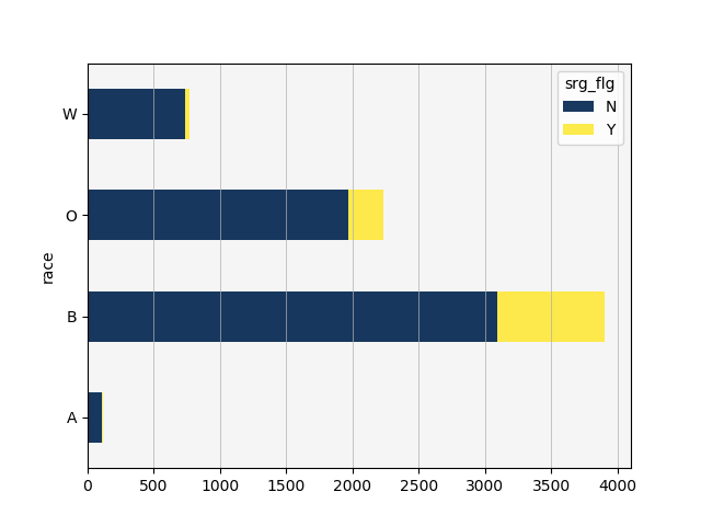
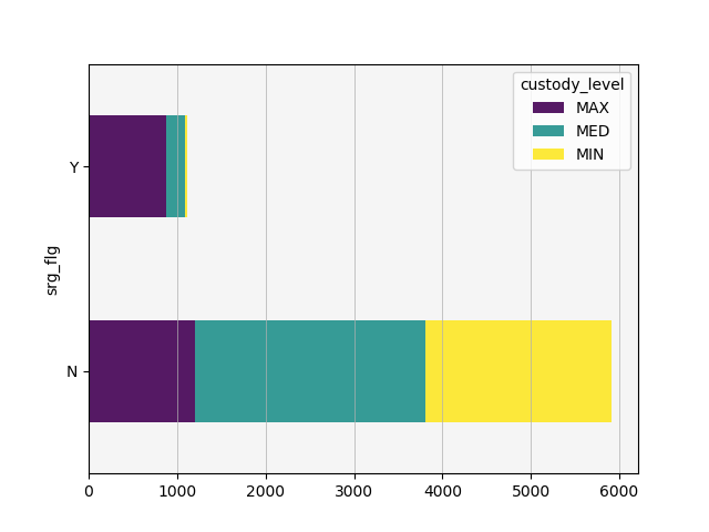
Very few white inmates are booked with a known gang affiliation, and inmates booked with a known gang affiliation are rarely assigned to minimum security. With a little over 2000 inmates in maximum security prisons, gang affiliated inmates account for 800-900 of those inmates. This does not entirely explain the discrepancy in custody level distribution by race, but it does account for some of the effect.
Summary and future work
I specifically wanted to avoid doing statistical tests or building a model using this dataset. The goal of the project was simply to retrieve data and visualize it - more or less to carry out the initial proprocessing and exploratory steps of a data science pipeline. This seemed like a reasonable goal for a weekend project, and I’m happy with where I got.
Going forward, I’d like to integrate the aggregate data collected here into a larger project utilizing more of NYC’s open datasets. The NYC Open Data platform hosts two arrests datasets that might prove informative: historic arrests and current year arrests. In addition, if I can find another city using the Socrata platform and hosting similar correctional data, it would be interesting to compare the aggregate results from NYC against another city’s department of corrections.
Vera’s dashboard for examining this data is pretty cool. I wanted to play with bokeh a little bit and see if I could put together any interactive visualizations, but unfortunately didn’t have time this weekend. Given comparable data from other cities, a good future project might be to build an interactive dashboard comparing correctional data across cities.
Thanks for reading!